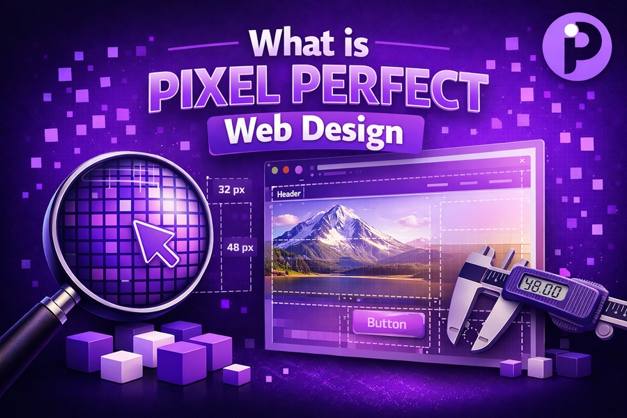
Pixel Perfect Web Design is the concept of creating a web design that aligns with the designer’s original vision, down to the finest detail. This design approach is all about achieving flawless visual accuracy, ensuring that every pixel on the screen matches exactly as intended. While it promises a polished and professional look, it often requires careful attention to detail and can lead to challenges, particularly when it comes to responsive design.
Understanding the importance of pixel-perfect design in today’s web development environment requires familiarity with both its advantages and limitations. By diving into the specifics of this approach, designers can better appreciate how this technique fits into modern-day website design, making it more than just a visual standard—it’s a means to deliver seamless, consistent user experiences across a variety of devices.
In the next sections, we will dive deeper into the characteristics of Pixel Perfect Web Design and how it compares to other design methodologies.
The Key Features of Pixel Perfect Web Design
Pixel perfect design revolves around the idea that every element of a website’s design, from buttons to margins, is precisely placed. Designers and developers go to great lengths to ensure that each part of the design is visually perfect at every resolution. With precise attention to detail, you can expect sharp, crisp designs that translate perfectly across high-resolution screens.
The primary goal is ensuring no deviation from the original design specifications, which gives websites a highly polished appearance. However, this design approach comes with its own set of challenges. The process of translating designs into functional code without losing pixel-perfect accuracy is time-consuming and can be expensive. However, the outcome often results in a superior user experience, making pixel-perfect web design a popular choice for high-end web projects.
For developers looking to incorporate pixel-perfect design, the use of design tools such as Adobe Photoshop, Sketch, or Figma is essential. With the help of these platforms, designers can create detailed layouts and mockups to ensure that the final result matches the intended vision perfectly.
Additionally, the ability to work with code and precise image assets is crucial for maintaining pixel accuracy. Many times, designers and developers need to manually adjust CSS and image scaling to ensure a perfect fit.
Before jumping into designing pixel-perfect websites, it’s also helpful to understand how pixel-perfect design compares with responsive design principles.
Pixel Perfect Design vs. Responsive Design
When you compare pixel-perfect design with responsive design, you see that both aim to create beautiful, functional websites, but they approach the task differently. Pixel-perfect design aims to achieve a perfect match between the design layout and the rendered output, regardless of the device. In contrast, responsive design adapts the layout to different screen sizes and resolutions, allowing websites to be functional on any device.
The key challenge with pixel-perfect design is that it doesn’t always allow for flexibility. As more devices with varying screen sizes and resolutions emerge, maintaining perfect accuracy across all screens becomes difficult. On the other hand, responsive design embraces flexibility, allowing content to adjust dynamically based on screen size. However, this flexibility often results in sacrifices in pixel-level accuracy.
Designers need to find a balance between the two approaches—pixel-perfect for design consistency, and responsive design for functionality across all devices. The solution often involves implementing responsive layouts while striving to keep the key visual elements intact, such as fonts, images, and icons.
By using frameworks like Bootstrap, developers can create responsive layouts that still preserve the visual fidelity that pixel-perfect design aims to achieve. Moreover, advanced tools like CSS Grid and Flexbox are essential for ensuring designs remain fluid and adaptable while still achieving pixel-level accuracy.
Benefits of Pixel Perfect Web Design
The primary benefit of pixel-perfect design is its ability to provide highly detailed and sharp visuals that create a premium look. This approach is ideal for designs that require fine details, such as landing pages, marketing websites, and portfolios. For brands that want to make a lasting impression with their web presence, pixel-perfect design ensures that their website will stand out.
Another advantage is the precise control it offers over every element of the design. From typography to color schemes, designers have complete control over how each component appears on the screen. This high level of control allows for consistency across the entire website, making it easier for users to navigate and interact with the content.
Pixel-perfect designs also contribute to enhancing user satisfaction by providing a seamless and visually pleasing experience. For high-end websites and e-commerce platforms, this design approach ensures that users will engage with the content in an intuitive and visually appealing manner.
One example of how pixel-perfect design enhances user experience can be seen in the design of call-to-action buttons, which are positioned precisely to stand out. The clarity of the button’s positioning encourages users to interact with it, boosting conversion rates.
For more on web design and its importance, see this informative guide on what is pixel aspect ratio.
Challenges of Pixel Perfect Web Design
Despite its benefits, pixel-perfect design comes with its challenges, especially when implementing it across various devices and browsers. The biggest issue designers face is ensuring that the design remains flawless across different screen sizes and resolutions. Different devices, browsers, and even browser settings can render the same design in various ways, leading to discrepancies in the visual output.
The complexity increases when dealing with various image formats and screen resolutions. As web design becomes more responsive and devices with different pixel densities are introduced, such as Retina displays, pixel-perfect designs must be modified or scaled up to accommodate these high-density screens without losing sharpness.
Another challenge is the time and cost required for pixel-perfect design. Designers must ensure that every single element is aligned perfectly, which often involves many iterations of revisions, especially when moving from design to code. This process is more time-consuming than designing responsive layouts, which require fewer design refinements. Moreover, the additional time and effort can translate into higher development costs.
To overcome these challenges, many web designers use pixel to inches converters for more accurate measurement conversions when designing elements that must appear crisp on different screens.
How to Achieve Pixel Perfect Web Design
Achieving a pixel-perfect design requires meticulous planning and attention to detail. First, begin by creating a comprehensive wireframe and mockup using a design tool like Adobe XD, Sketch, or Figma. These platforms allow you to place elements down to the pixel and adjust them as needed. Once your mockup is complete, it’s time to implement the design into code.
Make sure to use clean, semantic HTML and CSS. It’s crucial that the code reflects the original design specifications. Avoid shortcuts such as using non-scalable image formats. Instead, use SVG images for icons and illustrations, as these are scalable and maintain high quality at any resolution.
To further enhance the pixel-perfect design, consider implementing CSS Grid or Flexbox. These layout techniques offer greater control over how content is positioned and sized, ensuring that it remains consistent across different devices. Additionally, make use of media queries to adjust your design for smaller screens, keeping the pixel perfection intact.
For the best results, always test your design on multiple devices to ensure that it performs as expected. Tools like BrowserStack and Responsinator can simulate how your design will appear on different devices.
If you are seeking more tips on optimizing your designs, check out our guide on pixel size for printing.
Pixel Perfect Design in Practice
When you put pixel-perfect design into practice, it becomes evident that it’s a combination of both creative vision and technical skill. Many designers rely on high-end design tools and frameworks to help them achieve perfection. At the same time, the importance of collaboration with developers cannot be overstated. For pixel-perfect designs to be realized successfully, communication between designers and developers is key.
To make the process easier, it’s beneficial to create style guides that define the typography, color schemes, button styles, and other visual elements. This ensures consistency across the entire site and provides developers with clear guidelines for implementation.
Having a pixel-perfect approach does not mean ignoring other essential aspects of web design, such as usability and accessibility. It’s important to find a balance between aesthetic perfection and user experience, ensuring the site looks stunning and functions flawlessly.
Conclusion
In conclusion, pixel-perfect web design remains a valuable technique for those aiming for a visually polished, high-end user experience. While it offers unmatched precision and control over every detail, it’s important to consider the trade-offs in time, cost, and device compatibility. By balancing pixel-perfect design with responsive principles, designers can create websites that not only look great but also function seamlessly across different platforms.
For more information on achieving high-quality pixel-perfect designs, explore how pixel-perfect design works.